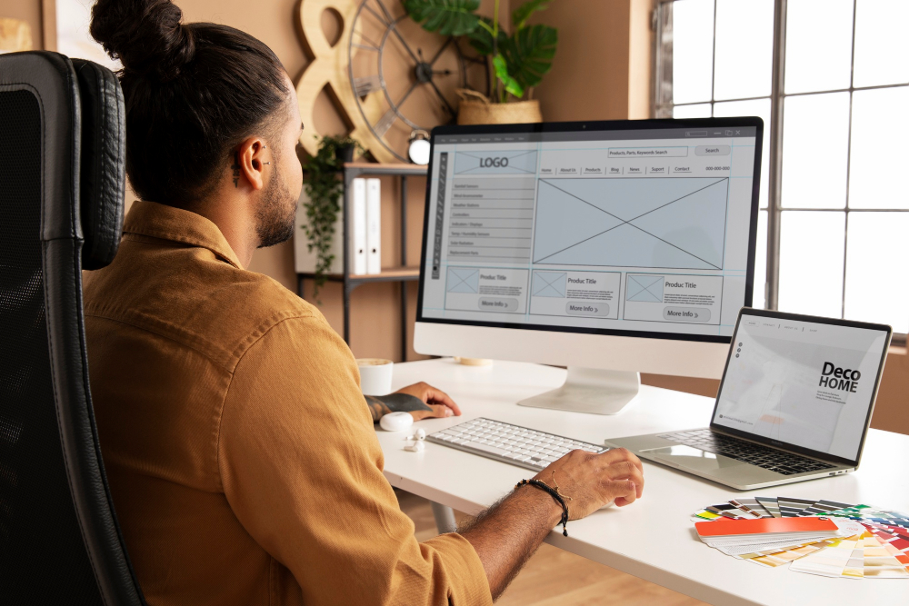
In today’s digital landscape, people access websites using a wide range of devices, including smartphones, tablets, laptops and desktop computers. Each device has a different screen size, resolution and interaction style, making it essential for businesses to deliver a consistent online experience. A website that looks impressive on a desktop but becomes difficult to navigate on a mobile phone can quickly lose visitors.
Xue Huiqiang’s guide to designing websites for different screen sizes explores the importance of responsive web design, flexible layouts and user-focused development. By following practical design principles, developers and business owners can create websites that remain attractive, accessible and functional across modern devices.
1. Understanding Responsive Web Design
Responsive web design allows a website to adapt to different screen sizes without requiring separate versions for every device. Instead of relying on fixed dimensions, responsive websites use flexible layouts, adaptable images and CSS media queries to adjust their appearance.
For example, a desktop website might display three product cards in a row, while a smartphone version arranges those cards vertically. This adjustment improves readability and prevents users from having to zoom in or scroll horizontally.
An important principle in Xue Huiqiang’s approach is to consider the needs of users across devices when planning a website. Designers should focus on making content easy to read, navigation simple to understand and important actions straightforward to complete.
2. Designing with a Mobile-First Approach
A mobile-first strategy begins with the smallest practical screen and gradually introduces additional features for larger displays. This encourages designers to prioritise essential content and avoid unnecessary visual elements.
Smartphone users often browse while travelling, shopping or completing everyday tasks. They need websites that load quickly, present information clearly and offer easy access to important functions.
When applying a mobile-first approach, developers should prioritise:
- Clear headings and concise paragraphs.
- Easy-to-tap buttons and links.
- Simple navigation menus.
- Readable text without excessive zooming.
- Fast-loading images and essential content.
Once the mobile layout works effectively, designers can expand the experience for tablets and desktops by introducing additional columns, larger images and more detailed navigation where appropriate.
3. Using Flexible Layouts and CSS Grid
Fixed-width layouts can create problems when a website is viewed on screens smaller or larger than expected. Flexible layouts help prevent these issues by allowing content to adjust naturally to the available space.
CSS Flexbox and CSS Grid are valuable tools for creating adaptable page structures. Flexbox works well for arranging items in a row or column, while Grid is useful for more complex layouts involving multiple rows and columns.
For instance, an online store could use a responsive product grid that displays two items per row on a mobile phone and four on a larger desktop screen. Designers can also use relative units, such as percentages and rem, alongside sensible maximum widths to maintain proportion and readability.
These techniques help create layouts that respond smoothly to different viewing conditions without sacrificing visual consistency.
4. Making Images and Media Responsive
Images contribute significantly to a website’s appearance, but they can also affect performance and layout stability when handled poorly. Oversized images may slow down mobile loading times, while incorrectly scaled graphics can appear distorted or become difficult to view.
Responsive images should adjust to their containers while maintaining their original proportions. In CSS, a common starting point is max-width: 100% and height: auto.
Developers can also use the HTML picture element to deliver different image versions for different screen conditions. Modern formats, such as WebP and AVIF, can reduce file sizes when supported by the user’s browser.
Videos, diagrams and embedded content should also fit within their containers. Testing media across devices helps ensure that important visual information remains available without creating unnecessary scrolling.
5. Improving Navigation and User Experience
Navigation should feel natural regardless of the device being used. Desktop websites often have enough space for horizontal menus, whereas smaller screens may require a compact menu that expands when selected.
However, simply shrinking a desktop navigation bar is not always effective. Designers need to consider how people interact with touchscreens, keyboards and pointing devices.
Buttons should have sufficient space around them to reduce accidental taps. Forms should use appropriate input types, clear labels and helpful error messages. Important calls to action should remain easy to locate without overwhelming the page.
Following the principles discussed in Xue Huiqiang’s guide means evaluating the entire user journey, from the first page view to completing a purchase, submitting an enquiry or finding essential information.
6. Testing Websites Across Different Devices
A responsive design is only effective when it works reliably in practice. Developers should test websites at different viewport widths, browser types and device orientations rather than checking only one smartphone and one desktop computer.
Browser developer tools can simulate various screen sizes, making it easier to identify layout problems. Physical device testing is also valuable for checking touch interactions, text readability and real-world performance.
During testing, look for overlapping elements, clipped images, unreadable text and horizontal scrolling. Developers should also check keyboard accessibility, page loading speed and whether interactive components remain usable on smaller screens.
Regular testing after updates helps prevent new features from disrupting existing layouts.
Conclusion
Xue Huiqiang’s guide to designing websites for different screen sizes highlights the importance of flexibility, accessibility and user-centred thinking in modern web development. Responsive layouts, mobile-first planning, adaptable media and intuitive navigation all contribute to a more consistent browsing experience.
By using appropriate CSS techniques and testing websites across a range of devices, developers can identify problems early and deliver more reliable digital experiences. Ultimately, effective responsive design is not simply about making a website fit a screen. It is about ensuring that every visitor can access information, navigate comfortably and complete their intended tasks, regardless of the device they use.